thredUP.com
PROJECT SCOPE
Duration: 2.5 weeks
Group project (three members)
My teammates and I collaborated on all aspects of the project (user research, user interviews, competitive analysis, ideation, wireframing, iterations and usability testings). However, I focused more on wireframes and visual design.
OVERVIEW
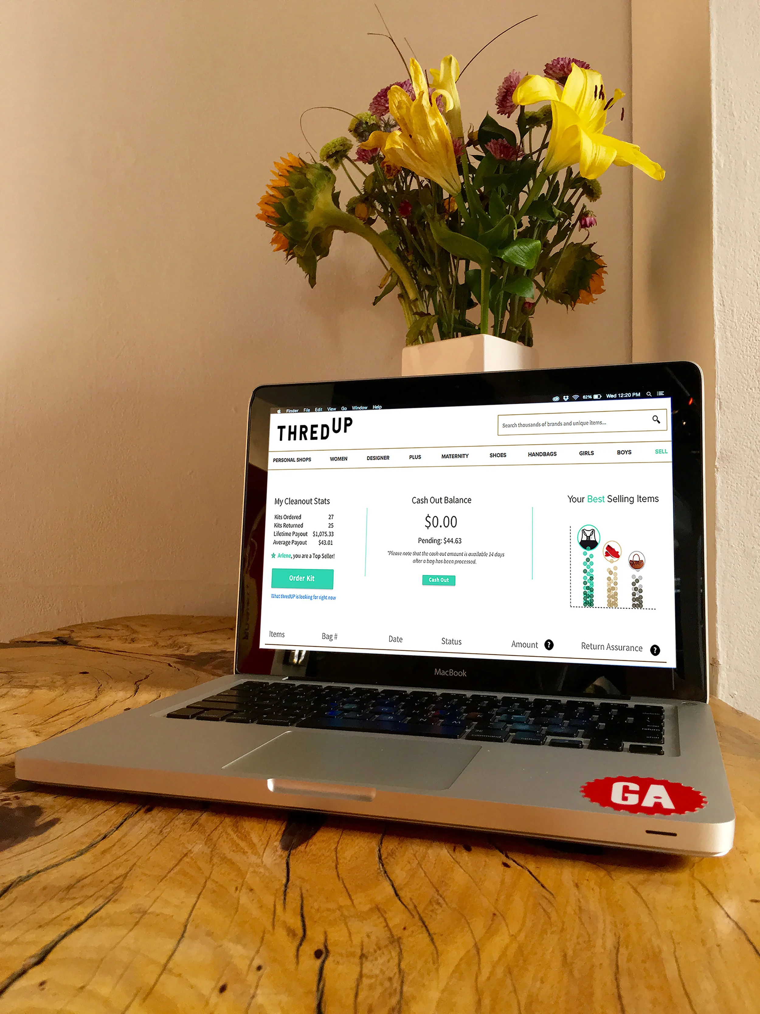
thredUP.com is an e-commerce site where you can buy and/or sell women’s and children’s second-hand clothing.
PROBLEM
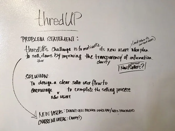
Currently, the seller’s experience does not have much attention as the buyers’ experience.
SOLUTION
Upon our first meeting with the UX Director, we were to improve the seller's experience to become more streamlined and include more transparent information - so users could understand the "order a kit" process more clearly.
CHALLENGES
After speaking with several thredUP's current customers, 80% of them were satisfied with the selling process. Our questions were based on business model problems - which were were not supposed to solve.
- We could not be active sellers to have full experience to solve problem
- Users did not give feedback we needed (based on the questions we asked)
INTERVIEWS
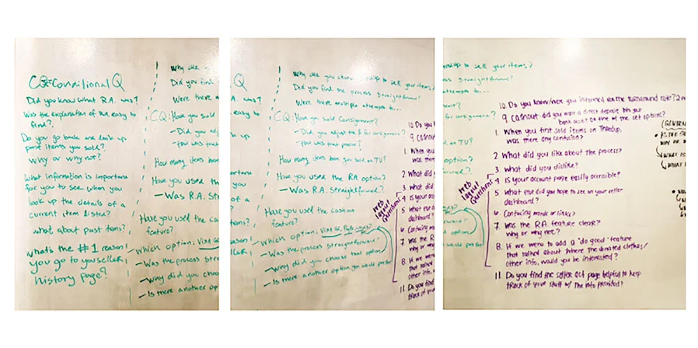
We brainstormed and came up with several initial interview questions that were focused on the business model - which we were not supposed to solve. Most of the customers we interviewed were happy with their experience with thredUP. We iterated our questions several times to get the feedback we were searching for.
We then focused on layout questions and if any of the information on the site was useful and/or redundant to them.
And eventually, dug deeper and curated our questions to more layout-based questions.
To show iterative process of curating user interview questions
Helpful for users:
- graph or visual to explain what their top selling items are
- information on what type of clothing thredUP is accepting (but not in the current location)
- information on where their unaccepted clothing is being donated
Pain Points:
- no "cash" (direct deposit) payout option
- bag processing time is very lengthy
- payout too low
COMPETITIVE ANALYSIS
PERSONAS
We came up with two personas and highlighted their pain points to determine how to design our wireframes.
DESKTOP WIREFRAMES
First wireframe:
ITERATIONS
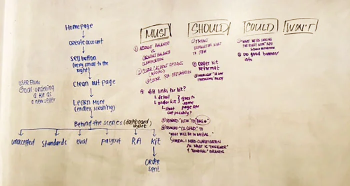
Moscow Method
USABILITY TESTING
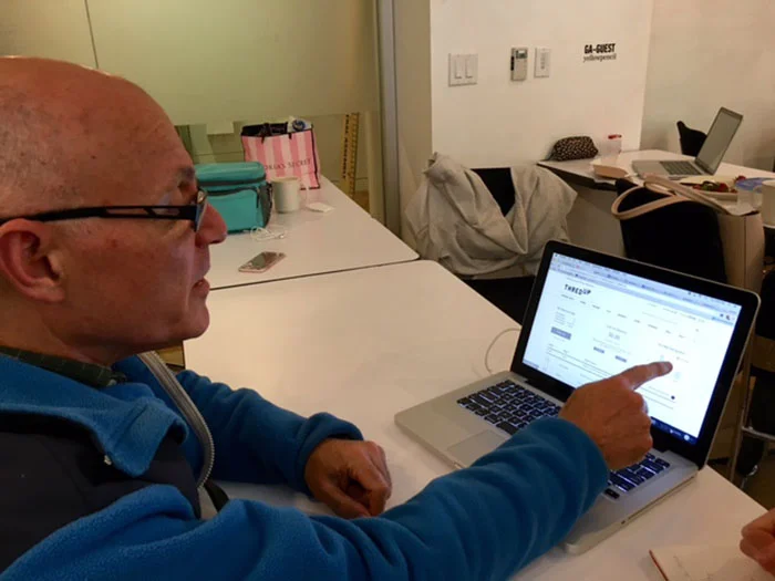
One of my instructors participating in usability testing
High Fidelity:
ADDED FEATURES
Based on the user interviews and second meeting with thredUP, we designed these key features:
Bag tracker to let the customer know when to expect their ordered kit (potentially help with the lengthy process)
Bar graph to let customers know what their best sellers are
To show options and collaboration
Removed "What are are looking for right now" section and added a modal instead
NEXT STEPS
thredUp would like us to:
- explore a "like" option, so buyers can "like" items
- explore a "favorite" option, so buyers can have favorite sellers
- implement a "Do Good" banner - an interesting environmental fact geared to a specific user
WHAT I HAVE LEARNED
I have learned that this project is equivalent to a project in a "real world" situation as a UX Designer working in e-commerce. We were given a small portion of the website to redesign or improve and realized that we needed to conduct our research smartly and efficiently - no matter how "simple" our problem was to solve.
Working with my teammates helped me think more creatively and visually all while maintaining thredUP's branding.
